
CITY OF LOS ANGELES

Role: Lead UX/UI Designer
Current website:
Primary Focus Areas in this project encompassed:
• Home Page
• Resident Page
• Job Page
• Business Page
• Visitor Page
• Government Page
• Calendar/Event Page
Problem:
The LA City website did not have a visual appeal to engage its audience. It was cluttered and confusing and appeared somewhat old and not up-to-date.
Design Goal:
To create an overall new design for the website and interface to appear more modern and appeal to masses. We wanted to have better categorization to get more clickability and popularity for the website as a whole. Our goal was to get users to have repeat visits and get the first-time user's to find the site appealing and easy to navigate.


Research Process:
Planning:
From the research we conducted we came up with numerous prototypes for our proposal. We created a new sitemap and sketches of what our potential new design would visually look like. We created wireframes before the mockup to make sure we were heading in the right direction.
How we began the journey: the Project roadmap was broken down into three steps,
Research, Planning, & Design for each page. This project took more than two years. The methods that are shown here are for just the Resident page. The same techniques and steps were used for other sections as well.


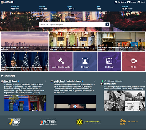
Home Page:
LA City website’s homepage has always been a home to popular services and important news, however, this time more sections needed to be added to the homepage. One was the Twitter embed and the other was news videos from another City website called channel 35. Also, we were tasked to come up with a modern look and feel for this page. In addition to modernizing the main body, drone footage of LA city was suggested for the hero section with a more minimal global navigation. And other details were added over the video (like the weather condition) to encourage more engagement.
New Design:

Old Design:
Resident Page:
The old version of Residents Portal does not present information in a way that best answers. Resident's city questions and it was confusing. And it didn't keep the user engaged or encourage repeat visits to the page.
The goal on this page was to create a dynamic design to help users (Resident of LA city) quickly access city data in a single source while keeping them engaged and delighted. Hence, significant changes in this page were visual/interaction design and Information Architecture. Added neighborhood info in a clean format, interesting Map, and Engaged with your community parts, which at a time had their separate URL needed to be inserted onto the Residents' page.
New Design:

Old Design:

Residents Page - After Address Entered:
For the more engaging and user-friendly design, we added the dynamic map on this page. Before the user put their address, the map and the graph data default to the City of LA location.
But after users enter their address on the rectangle box, the map will be zoomed in to their area to show places of interest, by choosing in the map's menu and the graph will show the data specific to their neighborhood area.
User Testing:
The new design was launched in January 2019 and since then we have been keeping track of the analytic reports and found some areas we wanted to improve on. We found that their wasn't that much user activity under the main CTA on the Resident page. To improve this we wanted to change the interface and make a more clean interface that would highlight the page and attract more activity. We also changed the font and categorization of the page. Hence, after a few changes we continued to monitor user testing and noted that users were more attracted to the page.


Business Page:
On this page, the most major problem was bad Information architecture, with mixed information, and data from different sections. So users had a hard time to find what exactly they wanted.
We have three different users for this page. 1. Those who want to start a business in the City of LA
2. Those who want to do business directly with the City 3. Those that already have businesses but are looking into applying for or renewing permits or certificates. Therefore the main goal in this section was classification information and sections in a clean and modern way.


Job Page:
Job page is one of the high demanding sections on this website, and it has three different users 1. the Users are looking to find a job in the City 2. Those who interested in the job development program and 3. Those who are looking for internships and volunteer opportunities with the City.
We design separate parts with different content for each group. One of the major goals in this section was to make the candidate excited about working at the City with modern and engagement design. Also, we add more content for each part to give users clear and understandable information about City job application processes and other sections.


Visitor Page:
This is the only section where we did not need to add content. Just a welcome video was added for the travelers and the major change was applied to the interface only.

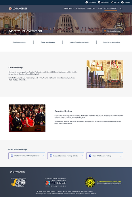
Government Page:
We kept a tight communication with the stakeholders to be certain that their expectations of us were met and we even went beyond what was expected of us. We wanted to make certain the Government's requirements were met as they had many clauses they wanted us to account for. One of the more popular section's is the Meeting's page and thus we needed to ensure we emphasized the City's elected officials and other significant organizations as well.
Major changes: Visual design, Information Architecture, Added content
Old Design

New Design


Calendar Section:
Old Design New Design

