LA Aging

Brief:
The city of Los Angeles Department of Aging provides community-based services to seniors and their caregivers to ensure the highest quality of life and to provide seniors with community-based activities.
Role: UX/UI Designer & Researcher
Platform: Desktop
Challenge:
The Department of Aging’s website has rich content that, if presented in a more efficient format, can help our senior citizens and their caregivers quickly access valuable data about the services and benefits the City has to offer. There were several challenges we wanted to address that included:
• Outdated Visual Design
• Broken Links and Stale Data
• Confusing Navigation (Repeated Data, Wrong Labels, Hard-to-use Forms)
Mission:
-
To re-design the Aging website to help users quickly and intuitively navigate the site and access desired information.
-
Make the interface more pleasant and welcoming to encourage repeat visits and engagement.

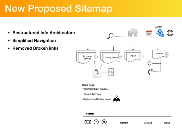
New Design: High quality of Mockup


Re-Design Process:
1- Heuristic Evaluation: A heuristic evaluation is a usability inspection method for computer software that helps to identify usability problems in the user interface (UI) design.
2: Competitive Analysis
-
Understand the general landscape in which our product will compete
-
Compare our product’s unique qualities against the competition
-
Identify possible user types
-
Compare visual and language styles


3-Google Analytics:
After doing market research and content audit of the website, the Audience insights on Google Analytics was the best way to know our persona in this project. It is a comprehensive breakdown and helps us with who our user is. It provides details such as demographics, interests, location, which device they use, frequency of usage, and time of most engagement.


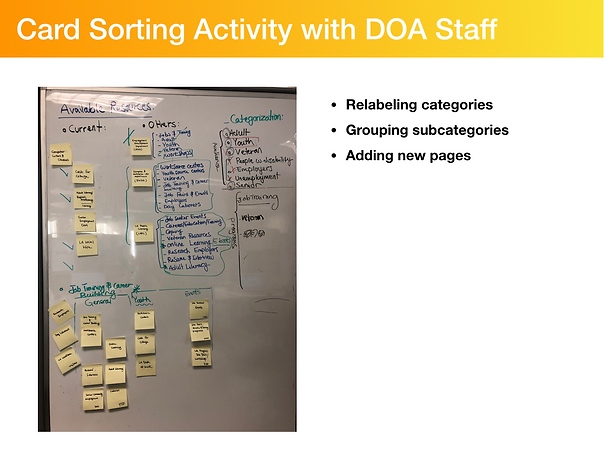
4-Card Sorting Exercise with the Steak-holders
After we organized the foundation of the interface we found some inefficiencies that we wanted to restructure the site to improve navigation and allow for more efficient navigation. This was achieved by decluttering the site and creating a clean organized and modern interface. This was specifically achieved by categorizing the tabs into more lamen terms language that would make it easier for users' to navigate.