FitPal Health

FitPal Health is a smartphone app that helps users track their diet and for a healthier lifestyle,
This app uses gamification elements to motivate users. To track nutrients, users can either scan various food items or manually find them in the app’s large pre-existing database.
In this article, I will be sharing with you my thoughts and process in designing the app. This project lasted 15 weeks in total and there were 4 main sprints: Research Sprint, Concept Sprint, Usability Sprint, and Design Sprint and now it's under launching phase.
Role: Senior Designer (UX/UI/AI designer)-iOS app
Duration: 8 weeks
Tools: Figma - Adobe - Google analytic. fluent experience in design and prototyping.

To understand user needs, I defined a Problem Statement and Persona focused on fitness enthusiasts. I then conducted qualitative interviews with users aged 22–49 to explore their fitness habits and what drives their decisions when using apps like FitPal Health.
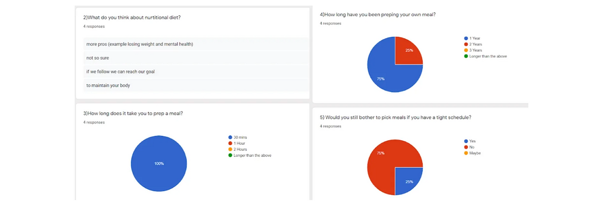
Google Forms: User Interview Questions
The User pain point’s
After conducting the interviews, I gained a clearer understanding of the challenges my users face. Many are juggling university assignments or work responsibilities, which impacts their ability to stay consistent with their fitness routines.
Refining the Problem Statement and User Persona
With the data collected from the interviews, I was able to draft a more refined Problem Statement and User Persona, with detailed goals and specific pain points.
User Journey Map
I also created a User Journey Map to visualize what users experience as they learn about and track their nutrition. Alongside this, I identified opportunities at each stage of their process to help them overcome their struggles.
Competitor Analysis
Based on user feedback, I analyzed apps that users found helpful, such as MyNetDiary, Lifesum, and FatSecret, with Lose It! being mentioned briefly. This analysis allowed me to compare these apps and gather insights for designing new features.


Final screens:
After analyzing the feedback from the previous user test, I made some adjustments and finalized the design with high quality mockups and design systems.
Usability Test:
Finally we’re now user testing with the Hi-Fidelity Prototype. The purpose of this test is to find out what users think of the overall design of the app. Here are the drop off rates of the current feature.
Overall, user feedback indicates that the course quiz has significantly improved and feels more complete.

Prioritize features
1. Exercise and personal trainer
1.Nutritionist
2. Cam-calorie
3.Avatar
4. leisure time ( New Health Articles)
5.Achievement
Features Proposal:
By organizing all the new features in a matrix diagram, I was able to determine which features to prioritize based on their impact and cost.
UX Audit:
Before diving into the design process, I performed a UX audit of existing fitness apps to identify common usability issues and opportunities for innovation. This audit provided critical insights that informed my approach to designing the features for the FitPal Health app.
Sitemap
A simplified and design the app's sitemap with the features and pages that I will be Designing.

Wireframes
With prioritized pages and features, I created wireframes for the first user test to gauge the target audience’s reaction to the newly proposed features and app layout.
Concept Test
Finally, I conducted a concept test using a low-fidelity prototype with the same interviewees. The feedback provided valuable insights based on the tasks I assigned to the users, helping refine the design further.
In conclusion, the overall feedback from users is that the FitPal Health app convenient and helpful to them. However, there were still quite a few things that needs to be fixed especially the user flow of the course quiz
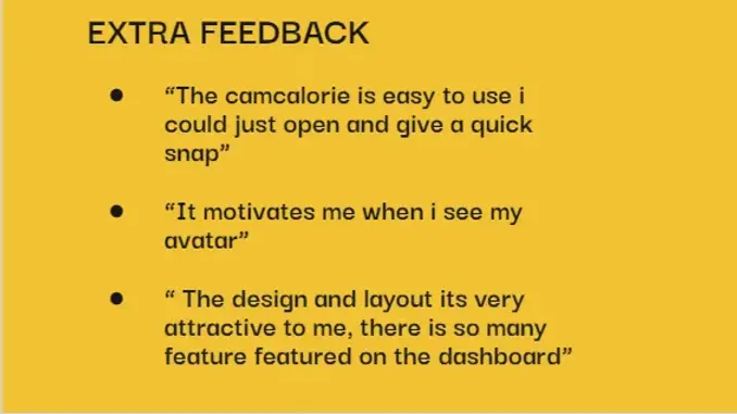
Below here are the top 3 favorites from users and their direct quotes:


Design System:


What I learned:
This project was both exciting and enjoyable as we developed a new technology for a wearable device. It provided valuable learning opportunities as I delved deeply into the UX process, embracing iterations of both failure and success.
Failing fast became a key approach.
After completing the UX stage, we quickly created wireframes. This allowed us to uncover issues in the user flow that hadn’t been visible before. Through multiple rounds of testing and valuable feedback, we were able to rapidly iterate and refine the design, driving efficient progress.